


FIRST IMPRESSIONS.
First impressions often leave lasting impressions. Impressions also result in people's perceptions. There goes that age-old debate -- "Perception versus Reality." I say that perception is someone's impression of reality. And sometimes... no matter what is reality, you just can't change people's perception of a situation or thing.Let's define these words...(im·pres·sion) noun: a characteristic, trait, or feature resulting from some influence; the act of impressing. (per·cep·tion) noun: a result of observation.
To make a long story short, "Yes, design does matter!"
? When you meet someone you hope to date, don't you want to make a good first impression? You want to be in nice clothes, have your hair just right and be in the right place at the right time.
? When you shop for books at the bookstore, doesn't the nicely designed books attract your attention... let's be honest, we do sometimes judge a book by it's cover then read on for content?
? When you meet people, don't you give them a firm handshake? Why do you do this? Because you want them to know you are confident.
? When you attend networking events and you hand people your business card, you don't want to say, "These are just my temporary business cards." I've heard this many times at networking events. You lose credibility and your ego and confidence gets deflated doesn't it?!
Your website can ruin or build your credibility. Which would you prefer? People can judge how professional and/or serious you are about your business when they start looking at your website (or any other marketing materials they get their hands on). Online (on the Internet) you have only a few seconds to impress your visitors before they make a conscious decision to click away or click for more information. So help them make it easy to click for more information.
You should put the same effort and attention in your marketing materials (business cards, letterheads, postcards, direct mail, voice mail greeting, etc.) as you do for growing your business. So if you decide to (re)build a website, remember that impressions online should compliment what you'd like your potential and current customers to remember you by... as if you had met face-to-face.
Posted in:
Web Design,
Web Developers
| Thursday, September 2, 2010

1. Not planning your site
Before you even have a website, you must have an idea, a focus. Why do you want a website? What are your plans and goals for the site? Sit down and draw out a map of possible pages and ideas for your site. Include your site's purpose --whether it is to sell more product or make the public more aware of your issue -- whatever it may be. Build your site from it's strong foundation (your goals) and you'll have a better, more solid site.
2. Failing to put contact information in a plainly seen location.
This could be disastrous. If a customer doesn't see this information, they can't contact you. You should consider a 'Contact Us' button or link from your Home page. Even better, make a link to your email address in your header or footer, somewhere that will show up on every page. Even if no one ever contacts you this way, just the presence of this information comforts edgy customers.
3. Broken Links
Do you enjoy clicking on a search result only to get a Page Not Found Error? No one likes them. Check your site statistics at least once a month (if not more) to make sure you don't have bad or broken links.
4. Outdated Information
A sure turn-off to a potential customer is the presence of old information. If it's July and your website is announcing the 'new' products available in February, your site just lost major credibility. Make sure your information is up-to-date. Consider adding a 'Whats New' button or a Business Blog.
5. Too Many Font Styles and Colors
This is a huge pet-peeve of my company. I've had people ask me to review their website and the first thing I notice is 4 different fonts. It looks bad, unorganized and unappealing. Different colors may attract the eye for a short time, but constant flashing or otherwise bright fonts (and graphics!) become annoying. Beware, this is a sure-fire way to scare people away from your site!
6. Orphan Pages
Every website has a heirarchy, a sort of tree that branches out from the Home Page. While most of your visitors visit you through your home page, there are times when a page further down interests someone, and they may copy that link and send it to a friend. This is where you need to pay attention. That friend may like what you have to offer, but they can't find out how to contact you, or how to get back to your Home Page. That's an orphan page. Every page on your site should, at a minimum, have a link back to your Home page. I would suggest adding a contact link at minimum.
7. Frames
Frames at one time were the talk of the industry. They were the original Content Management System (CMS) for your site. Nowadays they are few and far between. If you are designing a site, don't use frames. Newer technologies such as server-side includes are much more common and accepted. Your pages look fresher and those silly bars don't get in the way.
8. Disabling the BACK button and excessive Pop-Ups
Have you been to a website and decided that it wasn't the information you were looking for? When you clicked the BACK button, did you suddenly get a barrage of windows (or, pop-ups) to your dismay? These things rarely actually work, and worse off, the reason you hit the BACK button is because you DIDN'T want any more information from that site. Don't break the BACK button. There are other ways to get your user's attention.
9. Slow loading pages
While personal and hobby sites may normally be slow, there should be no reason for your business or other professional website to be slow loading. Today's Internet surfer won't wait long for information from your site - there are too many others with the same thing! Make sure your pages load quickly. If the server is slow, consider a different host. If your webpages are full of applets or large graphics, consider a page/site redesign.
10. Using Leading-Edge Technology
While the Internet is all about new and fancy stuff, don't be the first to do it. While it may 'look cool' to you, you ultimately need to decide if it actually enhances your user's experience. Do the flashy cartoons make your customer more apt to buy from you? Probably not. How many of your customers have to install a Plug-In just to see your page right? Do they have to upgrade their browser to contact you? Not good. Wait until the technology is either more of a standard or gone - you'll save face with potential and future customers.
Posted in:
Web Design,
Web Developers
|

Websites are more than just marketing tools, out there in Cyber-Land effortlessly promoting you and your products. While that's great, why not use that same website to save yourself some money?
How? Well, while I don't know your particular situation, I can provide you with some thought-provoking ideas that you can take back to your web designer for more input.
Reduce your support costs.
It is often cheaper, easier, and more effective to support customers over the Internet than through more tradiditonal methods such as telephone and direct mail. Services such as instant messaging and Get1on1 (www.get1on1.com) provide immediate chat facilities to current and potential customers.
Corporations can support their employees and business partners over their corporate intranets, keeping them informed and soliciting their feedback. Providing documentation for perusal saves time and reduces labor on your email server.
Providing a map to your location can save your receptionist valuable minutes on the phone explaining turns and streets, freeing her up for more important tasks.
Including a forum on your site can bring people of a common industry or interest together to discuss upcoming events, current problems, and other interesting ideas and thoughts. These forums can grow very large very quickly. And, in the meantime, your website traffic increases. Stick an ad on the forum and bring in more sales from people that you already know have expressed interest in your industry
Posted in:
Web Design,
Web Developers
|

Here are some basic things to know and plan:
The WWW
What is the www or the internet? Basically a network of websites from all over the world you can access via your computer for which you need an internet connection and a browser. Internet connections are available from ISPs, and most of the popular browsers are free downloads from the internet. Just like writing/typing an address on a postal envelope, you type the website address in the browser beginning with http://www. and ending with either .com, .net, .org, .biz, .nz, .uk, etc. So if you want to access the microsoft website, you would type http://www.microsoft.com in the browser and hey, presto! You get all the information about microsoft and its products on your browser. Just click on the available links and you are on your way.Your Website
Your website will be a bunch of pages all linked together via hyperlinks. You can ofcourse have a one-page website or as many pages as you like - depending on the amount of information you want to share with your visitors. Hyperlinks are text or images pointing to another page, just like the heading of this article points to my website.Your Audience
As the web has grown, so has the types of people who access it and how they access it. As we say, it is impossible to please everybody. It is very difficult to design a website which will be accessible to all. Carefully choose your content and design, keeping in mind who your target audience is and what type of equipment they use. Equipment here means the computer and other hardware and also includes the software used for connecting to the internet and browsing it. The best way to reach more people is to use pure HTML, and keep the use of scripting languages like JavaScript, Java, and other plug-ins to the minimum. While this may not make your site flashy,stylish or trendy, you will have the satisfaction of knowing that your site is accessible to most of the people. Afterall, that is the whole point of this exercise, right?
Designing your website means knowing your audience and their requirements.
Content
Now that introductions are over, lets get down to the core of your website: Content. The most important aspect of any website, content is the one thing that will keep your visitors at your site and keep bringing them back. The content should depend on what you want to let your visitors know - about the company, the products, the services. Keep the content interesting, updating it often for repeat visitors. Often this can mean providing more details about different aspects in your business, like seasonal discounts, etc. Your visitors will visit your site again and again if the content is relevant, and there is something new everytime they visit.
Layout
A well laid out website will be a successful one. Whether you design the site yourself, or outsource the task to a webdesigner like us, first layout your ideas on paper. Choose text, color and graphics carefully, they all contribute to the page load time. Starting with your Home Page, keep it fast-loading, with a good navigational structure. Try to follow the same layout for the whole website. Change the layout only for different sections and not different pages. If the navigation bar is at the top on your HomePage, keep it at the top in all the other main pages. Consistency in layout is very, very important.These are just some of the basics about building a website. There are many more, some requiring a article all about themselves. Keep visiting, as I plan to write about as many as I can.
Posted in:
Web Design,
Web Developers
|

1) Don't keep them waiting. Obey the "Eight Second Rule" (the one that says your Web page should load in eight seconds or less even over slower modems). Otherwise the viewer will probably lose patience and click the "stop" button.
2) Identify yourself. The first order of business is to identify your company and products or services. Let the viewer know they've arrived at the right destination and give them an idea of what you have to offer.
3) Make a good first impression. Your color scheme, design, graphics, and text should all contribute to a favorable first impression and convey the right corporate image. Your site visitors will probably decide within 5 to 10 seconds whether to stay and look around, so you've got to keep them interested.
4) Provide a preview. Use links, text and graphics to give the viewer an idea of your website's contents and encourage them to explore the rest of your site.
5) Don't make a splash. Don't make your first page a "splash page" (meaning a large graphic containing little or no text that's designed to act as a gateway to the rest of your site). Your visitors won't be impressed and neither will the search engines.
6) Lead the way. Provide obvious ways for your visitors to move to the various sections of your website (links, a site map, site search feature, etc.). You want them to come in and look around, so make it easy for them to find their way.
7) Don't waste the space. A monitor screen doesn't give you a lot of space, so use the available space for content with the maximum impact for your home page -your product line, main benefits, competitive advantage, etc.
8) Don't link away. You work hard to get people to visit your home page, so don't lose them right off the bat by giving them the opportunity to link away to another site. Put reciprocal links, ads, etc. on other pages deeper within your site.
9) Start selling. From the moment a visitor arrives at your home page, you should begin leading them toward the sale. Write concise but powerful copy that goes beyond telling to selling and emphasizes benefits to the user. Consider posting a special offer on your opening page.
10) Be kind to search engines. Including accurate title, description, and keyword meta tags in your HTML code, plus relevant content, will go a long way toward getting your site indexed properly by search engines, and that will lead visitors to your virtual doorstep. Remember that many search engines use "spiders" to explore your website automatically, so your home page must include links to the other sections of your website.
Posted in:
Web Design,
Web Developers
|

Compatibility: Will your website display correctly for most people regardless of their computer hardware, operating system, browser and monitor resolution? Make sure your site renders properly for as many users as possible. If any features of your website require certain browser plug-ins, provide a download link. Remember that not everyone will have Javascript enabled and that graphics can be turned off by the user; make sure your site will still work without them.
Completeness: None of your website should be "Under Construction". Websites tend to evolve over time and are never truly "finished", but that's no reason for your website look like a construction zone. If you must include pages that aren't completed, at least put some informative content on the page to motivate people to check back later. Otherwise leave out the section altogether until it's ready for prime time.
Content: Do you need to update the text on your site? Have you added services, expanded your product line, targeted new markets, or changed your business strategy? Is your website's description of your company current and accurate, including your contact information? Could the content be written more clearly, convincingly, or succinctly? Could your website be more informative, helpful, interesting or relevant? Would customer testimonials or an FAQ section strengthen your sales message? Check all of your site content for incorrect grammar, spelling errors and typos.
Graphics: Do your graphics contribute to or detract from your website? A website with no graphics would be uninteresting, but a site with too many graphics, animations, and different fonts is overwhelming and distracts from your sales message. The trick is to find the right balance. Use animations sparingly, especially those that "loop" (play over and over). They can easily become annoying and distract from your sales message. Remember that banner ads count as graphics, too, and one or two per page is plenty.
Interactivity: You might consider making your site interactive by adding a mailing list, message board, poll, ezine or guest book. A contest or trivia quiz can attract visitors and bring them back more often. Rotating content like a joke, quote, or tip of the day keeps your website interesting. Don't feel obliged to add all the latest bells and whistles just because you can, but ask yourself whether some advanced features might give your website the edge. If you don't want to provide the content yourself, check into content available from syndicators (just keep it relevant to your target market and your other site content).
Links: Are all the links on your website working? First make sure any links between pages on your site are directing site visitors to the correct page. Check all of your links to other websites, too; the webmaster may have renamed the page or removed it altogether, and those dead links will make your site look unprofessional and frustrate your site visitors. If you've removed some of the pages from your own site, set up a custom 404 page that redirects your visitors to your home page (or a search page) when they try to access a page that no longer exists.
Speed: Does your site load quickly enough in the viewer's browser? The "Eight Second Rule" is a good rule of thumb, meaning no site visitor should have to wait longer than eight seconds to view the opening page of your website. After eight seconds have elapsed, chances are good the viewer will give up and go elsewhere. If you have graphics or animations that take awhile to download, provide some engaging content to hold their interest while they wait. Adding graphic elements always comes at a cost in terms of slower loading times, so only include graphics if they really contribute to visual impact of your website and strengthen your sales message.
Navigation: Is it easy to find information on your site? The opening page should tell visitors, at a glance, who you are, what you do, and how to find what they're looking for. From there your visitors should be able to follow a logical path to learn more about various aspects of your business. If you list products or services on your site, organize them in a logical way. If you decide to use graphic icons instead of text, make sure their meaning is obvious. Make it easy for your site visitors to find what they came for.
Search engine optimization: Is your website optimized to rank for important keywords in the most popular search engines? Double check your page titles and meta tag keywords and descriptions to make sure they are accurate and descriptive. Did you work your keywords into the actual page content as well (including variations)? Is your website focused on a specific theme, and do you have plenty of informative content related to that theme? Is your website spider-friendly (meaning search engine spiders can access every page and read the most important content from the source code)?
Style: Is your website's style consistent with your business goals? Ask yourself what you want your business image to be, and make sure your website enhances that image. Is your company's style polished? Friendly? Trendy? High tech? The look and feel of your site should reflect that style. Does your website still compare favorably with those of your competitors? Your website should reflect favorably on your business and help you to build your corporate image. If yours doesn't, maybe it's due for a makeover.
Posted in:
Web Design,
Web Developers
|

The only option that most of us have in order to design a good website is to hire a web- designer. Web-designers can help you come up with a great website that looks professional and is coded to perfection, but what about the time factor, leave alone the costs. Here's where web templates come to the rescue.
What are web templates?
Wondering what web templates are? Well, to put it in simple terms, web templates are semi-finished, pre designed web pages that can be used to create and host websites in less time. They are coded and have everything from graphics to logos and can be customized if required to add new pictures, content etc.Why are web templates considered semi finished WebPages?
Web templates are semi finished in the sense that they are not ready to upload as they are. You need to add certain elements to make them look complete. Some of the main elements that you need to add includeWhat is the price range of web templates? Web templates range in price depending on the type of templates, terms of usage, package deals, membership deals, files provided etc. Typically a professional template with non-exclusive rights could cost you anything between $20 to $100. This is way lower as compared to what a web designer would ask you for designing your website, not to mention the time factor. Copyrighted templates with exclusive rights could cost you anywhere between $350 to $1800 per template. Some template providers like http://www.buytemplates.net can offer you high quality templates for much lower costs.What are the files I should get with the purchase of a template? The files that you get on the purchase of a template differ from vendor to vendor depending on the type/feature of the template. Regardless of the type of template some files that should accompany your purchase are as follows,What kind of rights do I get over the web templates? Basically there are two types of templates; exclusive (copyrighted) templates and non- exclusive (non-copyrighted) templates. An exclusive template gives you ownership rights over the template whereas a non exclusive template does not give you ownership rights but only usage rights. Exclusive web templates are a bit costly and will ensure that the template is not resold to any other customer. You may use the template as your like and even resell it to other customers. A non-exclusive template on the other hand is cheaper and gives you only usage rights over the template. This means you can modify the template as per your needs but cannot resell them to a third party. Non-exclusive templates also mean that the same template can be resold by the template provider to more than one customer.How do I edit the web templates? Basically editing involves inserting the content, changing the style and adding/changing graphics. This can be done using the psd, index.html and other files that the web-template provider gives you on purchase of specific templates.Editing images and graphics You would require PSD files in order to edit images and graphics like change image color; add/remove image layers etc. PSD files are those created using Photoshop and can be edited using Photoshop, ImageReady, imac or other image editing software programs. You can also change images to your liking. The best place to look for quality images for your templates is 'gettyimages.com'.Editing content If you only need to change/insert content of the template, you can go for editing the index.html file. The index.html file is provided by all template providers and can be edited using Html editors like FrontPage, Dreamweaver, Golive etc. You can also edit content using text editors. Index.html can also be used for removing/replacing images, changing links, adding meta-tags, adding alt texts, adding title and changing image sources.Editing layouts and styles For editing layouts and styles you would require a CSS style sheet. A CSS style sheet is a document that lets you make changes like text color, text/paragraph spacing, headings, links etc to multiple pages. Always ask your template provider to give external CSS style sheets as they are easy to edit. CSS can be edited using any HTML or text based editors.In case you find the editing part difficult you can make use of web template customization services that are provided by most template providers. Domain registration and hosting Domain registration and web hosting are crucial for your website to appear online. There are many template providers who offer allied services like domain registration and hosting. Some even provide services like content development and search engine optimization. So be sure to buy templates from template vendors who offer these additional services. Some template providers like 'buytemplates.net' offer template related services irrespective of where you actually purchased the template from.Where can I find quality web templates? The internet is filled with websites that offer web templates. All that you need to do is insert a keyword like 'corporate web templates' in google or yahoo! to get a SERP crammed with web template providers. But finding quality templates from this crap is a bit difficult. A template many look glossy on your screen but may contain bad coding and low grade graphics. Some may be cheap but will have bad or no service associated. So how to find the best web templates in this heap load? The best way is to ask your-self these seven questions before making a buying decision.Questions to ask before buying web templates Best web template providers online Some of the best web template providers online who offer high quality web templates at affordable costs are www.buytemplates.net (Buytemplates.net offers quality templates at affordable rates. They also provides allied services like template customization, content insertion Search engine optimization and web hosting), http://www.templatemagic.net (offers quality affordable templates), designgalaxy.net (this site also offers logo designs, flash intros, Photoshop designs and PowerPoint templates along with web templates.) and interspire.com (This site is a must visit for anyone looking for free website templates. Their free templates are of good quality and are updated regularly. You can also get hold of free newsletter templates and logo designs here) |
Posted in:
Web Design,
Web Developers
|

How many times have you gone back to buy from a website you've had a lousy experience with? My guess is not very often. I know I don't. How many times have you gone back to buy from a website you've had a great experience with? What was the difference between the two experiences? Do you think the website you had the great experience with was a customer oriented site? And, might it be the other website you had the bad experience with was a sales oriented website?
A business can't survive very long if it's prime motivator is purely focused on sales and revenue. Sure, it may last for a while, but not long-term.
As webmasters and marketers, we must strive to create a long-term business relationship between ourselves and our customers so that they will continue to buy from us for as long as they have a need or desire for our products or services.
No One Does It Better Than Amazon.com
Arguably, http://Amazon.com is one of the largest customer oriented and successful website businesses on the planet. They're proof that "build a customer oriented website and they will come." They go out of their way to personalize the shopping experience for every single person.
When I visit Amazon.com, I see a very different selection of products than Linda, my wife, sees when she goes shopping. They know what I've purchased in the past and understand my buying habits. They also understand that my buying habits are different than Linda's and are different than yours. So, they tailor the individual experience for each of us. It makes us feel like the site has been designed around our specific desires.
Amazon.com has gone to a tremendous amount of effort to individualize our experiences. Why? Customers are their prime motivator. Would it have been easier and cheaper to build a strictly sales oriented, sales motivated website? Sure. Would they be the most successful website on the planet if they had done that? Do I really need to answer that?
Customer Oriented, Customer Motivated Website
Okay, so you get the drift of where I'm going with this. You may not be out to kick Amazon.com from the top of the ladder, but the principles are applicable to any website whether you're selling one product or millions of products.With that in mind, you've decided that your website is going to be customer oriented whereby customers are the prime motivator and your business will revolve around their satisfaction.
You already know from your past experiences that customers will go back to websites where their experiences have been positive. You also understand that the web's a finicky place and it's a "one strike and you're out" business environment. Therefore, you're going to develop your website using your own experiences as a customer as your guide.
What did or didn't you like about the websites you've done business with in the past? What brings you back to the ones you've had good experiences with time after time?
Give Your Customers What They Want
Customer oriented websites will win out over sales oriented sites every time and for the long haul. Develop your customer oriented website to ensure them a satisfying experience and they will tell their friends about you and so the word gets around. Pretty soon your site will be flooded with friends of friends of friends who will all become life-time customers. Lots of happy, satisfied and paying customers means a long-term, profitable and prosperous business. Enough said?Posted in:
Web Developers
|

If you don't think that color speaks just complete this sentence, "red means ---- and green means -" even a child will know what red means stop and green means go. If such simple ideas work for all of a given culture or market what could it mean to the graphic design of your website, brochure, or product if you know some of this information.
First let's start with the basics. The color wheel. We've all seen it. The color wheel shows the basic colors, each wheel is different in how many shades of each color is shown, but they are essentially the same.
Color harmony, colors that go together well. These will be colors that are next door to each other on the color wheel. Such as blue and green. In reference to clothes these colors match each other. Instinctively most of us know which colors go together when we dress ourselves every morning.
Color complements, colors that set each other off, they complement each other. These are colors that are opposite on the color wheel. Such as blue and orange.
Color depth, colors can recede or jump forward. Remember that some colors seem to fall back such as blue, black, dark green, and brown. Other colors will seem to step forward such as white, yellow, red, and orange. This is why if you have a bright orange background it may seem to fight with any text or images that you place on it. The orange will always seem to move forward.
Now you have the basics so let's go further. Just because to colors go together or complement each other doesn't mean that yo necessarily want to use them on your project. I opened this article with the meaning of colors now here is an example, keep in mind this is one example from western culture.
Color Survey: what respondents said colors mean to them.
Happy = Yellow Inexpensive = Brown
Pure = White Powerful = Red (tomato)
Good Luck = green Dependable = Blue
Good tasting = Red (tomato) High Quality = Black
Dignity = Purple Nausea = Green
Technology = Silver Deity = White
Sexiness = Red (tomato) Bad Luck = Black
Mourning = Black Favorite color = Blue
Expensive = Gold Least favorite color = Orange
So in designing your project it's important to know what colors mean. You can now see why a black back ground with green type would be bad, beyond being nearly impossible to read, if your target market thinks that black represents mourning and green makes them sick. There are exceptions to every rule of course.
So you may want to include some research in what colors mean to your target market. Colors that would get the attention of a teen would probably annoy an older person and the colors that appeal to the older person wouldn't get a second look from a young person.
Color may be one of the most overlooked aspects of design.
Posted in:
Graphics,
Web Design
|

The drop capital gives the page a nice finishing touch, and certainly adds a more professional looking feel.
Online, the drop capital looks just as good on web pages as it does in print. The only drawback is that you can easily get the whole effect wrong, and end up with a less than appealing result.
The wrong way...
When most people attempt to create a drop capital effect on a web page, they usually just enlarge the first letter by a few font sizes and make it bold.If you do this on your own web page, you will notice that instead of a 'drop' capital effect, you end up with an odd looking letter which sticks up above the rest of the paragraph, and just looks out of place.
The right way...
There are essentially, two parts to creating the drop capital effect.Step #1 -
You need to create a drop capital image using some graphic software.You can use any standard piece of graphic software like Paint Shop Pro, Fireworks, or Photoshop.
The drop capital image should ideally be big enough to drop down between 2-4 lines of text, depending on your preference.
You should ensure that the top of your drop capital image is level with the top of the text next to it. The bottom of the image should also be level with the bottom of the lowest text next to it.
This is really the hardest part of creating a drop capital effect. It can be very easy to make the image just a bit too big, or a bit too small. You may find that it will take a bit of trial and error to make it look just right. However, the extra effort will pay off, as the end result will be worth waiting for.
One thing to note: As with any image, a drop capital image can slow a web page if the file size is too big. To help reduce the file size you should save it as a '.gif' image. For even better results you should try to optimize the '.gif' image as well by reducing the amount of colors being used.
Step #2
This step is the easiest bit?Once you have created the drop capital image, all you have to do now is to insert it into your web page. You just add the image to the web page in the same way that you would with any other image on your page.
When you place it at the beginning of the paragraph, make sure you remember to delete the first letter of the normal text. Otherwise you will end up starting the paragraph with two of the same letter.
Align the image to the left
Initially, you will notice that the drop capital image just sits on top of the first line, instead of dropping down into it. Not for long!
All you have to do now, is align the image to the left, and you will see it drop down instantly into the paragraph.
If you are using a web page editor to create your web pages like Microsoft FrontPage or Macromedias Dreamweaver, aligning the image to the left is pretty easy.
In FrontPage:
Select the drop capital image by left clicking it once. Then click on the align to the left short cut icon in the top menu bar. Alternatively, you can select Format, then Position from the top menu. In the pop up window, select Align Left under Wrapping Style.In Dreamweaver:
Select the drop capital image by left clicking it once. Then in the properties window, click on the arrow in the drop down menu next to Align, then select LeftIf you are using a different web page editor, you should have a similar align option in the menu area. Alternatively, you edit the HTML code directly yourself. Just add the following command in between the brackets of the image tag:
align="left"
Thats literally all there is to it!
If you have multiple pages on your website, youll probably going to need to create a number of different drop capital images for each letter of the alphabet. The extra effort will be worthwhile as you will end up with a much more professional looking website.
Posted in:
Web Design,
Web Developers
|

Do you want people to come to your site and then tell their friend and family about it? Do you want to have huge amounts of visitors? Do you want to succeed in making your dreams come to fruition on the Web? Make your website exciting! It might be easier said than done, but there are people around whose job it is to construct and design sites for a living. If you can afford it, go for the best. How great is it when you come across a site that has some special feature that you've never seen elsewhere? Isn't it great when you find a site that relates to one of your interests that is simple and easy to get to the information you want? If you want to have people to come back again and again, you've got to keep updating the content to keep it fresh and interesting. Have a way for people to communicate with yourself and others who are into the same things. E.G. Forums, message boards and comments. The aim is to catch the 'viewer's' interest. A lot of sites just look like giant advertisements and you have to search for the needle in the haystack to find out what the actual site is for. I know advertising is a way of making money, but if you want your site to have an authentic, respectable atmosphere that exudes a feeling of integrity, you better be careful. People are becoming wary of this consumer driven, mindless attack at the average civilian's wallet. Some people will automatically leave a site if a bunch of commercials pop-up on the screen. Pop-ups, don't even make me go there? So, the aim of the game is to make a site that offers the public to be part of the action as well as being a source of knowledge or information that is in demand. A simple to navigate, good 'feel', and if possible-innovative site is the means to becoming the popular Internet magnate you've always dreamed of becoming. Another important fact is the idea of 'you'. Your website is a chance to put your identity out there in the world. Be yourself. If you try to appeal to an audience in a way that doesn't reflect your true self, you're destined to fail. Be honest and speak from your real perspective on life. Give it to us from the heart.
Posted in:
Web Design,
Web Developers
|

- For low-waist jeans, use navel diamonds and gems to accentuate a cute belly-button. You can also wrap silver chain-belts around your tummy, to shimmer while you dance "the bump". For a totally 70's look, add on colorful bangles and large hoop rings.
- For capris, wear anklets - either a slim gold chain to accent a trim ankle or ethnic beads for a "beach-babe" look. You can also add hip body bags for a sportier look.
- For cargos, those handy Swiss knives bring action to your jeans, as do large backpacks. You can also wear Buddha beads which bring luck for extreme adventures.
- For high-waist pants, use large dark-colored snakeskin belts to hide the height of the waist. Never use bright colored or diamond belts - it'll grab all the attention.
- For tattered or ripped jeans, wear kerchief belts for a handy-man look. You can also position a kerchief in your backpocket to call attention to a sexy bottom. Don't use overpolished accessories with the grunge look such as diamond or leather belts - it's an extreme combination.
- For loose or baggy jeans, more oversized chains clipped from the belt-line to your pocket give you a "gangsta" look. So do vintage pocket-watches, which bring out the "hip-hop" style. And if you're in for the "chicano" look, wear plaids as well as bandanas or hairnets.
- For cigarette pants, use "l-mac" (colored-transparent plastic) belts for a "be-bop" look. Gold or silver jewelry and fancy anklets can also dress up your jeans. never wear anything ethnic - it ruins the polished style.
Posted in:
Clothing,
Fashion Tips
| Wednesday, September 1, 2010

The first thing you need to decide on is your budget, as this will limit which brands and perhaps styles, you can buy. Many discount footwear stores have great sales, sometimes giving you up to 80% off the original price or even running two for the price of one sales. So, if you see sales like these, take advantage of them!
Once you've decided on your budget, you should think about what type of shoe you want to buy. Do you plan on being on your feet a lot? Do you want you shoes to be a fashion statement, or are you more of a 'sensible shoe' type of person? They are many new hot fashions this summer, ranging from dainty sandals to towering stilettos. While a pair of cute high heels may match your new skirt perfectly, they may not be right for you if you are going to on your feet, running around all day. So, make sure that you put some thought into where- and how long- you will be wearing them.
When it comes to actually trying on a pair of shoes, there are some general rules that you should try to follow. If you can, try the shoes on late in the day, as your feet tend to swell slightly as the day progresses. If you plan on wearing socks with the shoes, remember to bring a pair with you to the store, so that you can try on the shoes with them to give you an idea of how comfortable they will be.
Finding a comfortable pair of shoes should not be a challenge, especially if you know what to look for when buying them.
Posted in:
Fashion Tips,
Shoes
|

bar." Original recipe yield: 30 bars.
INGREDIENTS:
3/4 cup sifted all-purpose flour
1/2 teaspoon baking powder
1/4 teaspoon salt
2 eggs
1/2 cup chopped cashews
1/2 cup packed brown sugar
1/2 cup white sugar
2 tablespoons butter
1 1/2 tablespoons light cream
1/3 cup chopped cashews
1/4 cup packed brown sugar
--------------------------------------------------------------------------------
DIRECTIONS:
Preheat oven to 350 degrees F (175 degrees C). Grease a 9x9 inch baking pan.
To prepare Pastry: In a large bowl, mix the eggs and both sugars together. Blend in
the nuts and sift the flour with the baking powder and salt. Add to egg mixture and
blend well. Press into the bottom of the greased pan.
Bake for 20 to 25 minutes. While pastry bakes, mix 1/4 cup of brown sugar, cream and
cashews into the melted butter.
Spread over baked pastry and place under a broiler for about 1 minute, until topping
bubbles and becomes brown. Cut into bars while warm. Let cool in pan.
Posted in: |

Silver has been used since ancient times, but has not survived as well as ancient gold because it tarnished and decomposes. There have been times, however, when silver was "in"; we are going through such a vogue today.
Silver is the most common of the precious metals. Fine silver is pure silver, which is seldom used for jewelry because it is too soft. Sterling silver is 925 parts silver to 75 of copper, the alloy most often used. Silver weighs about half as much as gold, has greater flexibility, but is not as malleable, it has always been less expensive as well. A comparable piece of gold jewelry might cost four or five times that of a piece of sterling silver jewelry.
The current fashion trend toward black clothing has made silver jewelry more popular than ever. Silver likes to be worn; it stays cleaner & shinier through movement and friction. So sterling silver is a perfect accessory for today's fast paced lifestyles. Much like gold, sterling silver needs to be cleaned.
Care and Cleaning of your Sterling Silver Jewelry
1.) For daily cleaning it is recommended to use a simple jewelry polishing cloth that is impregnated with special jewelry cleaner. These are widely available and are very easy to use. Store your cloth in a plastic zip-lock bag, and keeping your jewelry drawer or armoire. It is a good idea to have one cleaning cloth for gold and one for silver.2.) For a slightly more "in-depth" cleaning you may want to use a liquid jewelry cleaner.
3.) For cleaning badly tarnished silver, here's a neat little trick
a) Cover the inside bottom of a heatproof glass dish on bowl with a piece of aluminum foil, shiny side up.
b) Place the tarnished silver in the bottom of the dish, contacting the aluminum foil.
c) Add 1 heaping tablespoon of baking soda, and then slowly pour boiling water to cover the piece. The tarnish will gradually collect on the aluminum foil.
d) Remove your silver, rinse thoroughly, and polish.
Here are Some Tips for Greater Enjoyment of your Sterling Silver Jewelry
1.) Are your silver chains all tied-up in knots? If so, here's a nifty little trick for straightening them out. Dust your chain with a little talcum powder and then try to unknot it. If the knot is stubborn, place a small drop of baby oil on a sheet of wax paper. Lay the knot in the oil and work it out with two pins; then clean the chain as instructed below.2.) Always apply make-up, perfumes, oils or colognes before you put on your jewelry.
Posted in:
Fashion Tips,
Jewelry
| Tuesday, August 31, 2010

1. Remember, even the hardest gemstone variety can be vulnerable to breakage if it has inclusions that weaken the crystal structure. Exercise common sense: if you have a ring set with a softer gem variety or an included stone, take it off before strenuous exercise. Even the hardest gem of them all, diamond, can shatter in two with a single well-placed blow. Never remove rings by pulling on the stone: that habit may result in a loose, then lost, gem.
2. Most importantly, store each piece of gemstone jewelry separately so that harder stones don't scratch softer ones. Almost every gemstone is much harder than the metal it is set in. Gems can scratch the finish on your gold, silver or platinum if you throw your jewelry in a heap in a drawer or jewelry box.
3. Rings in particular tend to collect dust and soap behind the gem, particularly if you wear them all the time. You need to clean them regularly to let the light in so your gems can shine. To clean transparent crystalline gemstones, simply soak them in water with a touch of gentle dish soap. Use a bowl of water rather than the sink to eliminate the risk of anything going down the drain. If necessary, use a soft toothbrush to scrub behind the stone. Rinse the soap off and pat dry with a lint-free cloth (you want to make sure threads won't catch on the prongs) For diamond, ruby or sapphire, a touch of ammonia in the rinse water won't hurt a bit and can add extra sparkle (for platinum and gold only, not silver!). Think twice before putting gems in an ultrasonic cleaner. Diamonds and rubies and sapphires will be fine but many other gems many not be, in particular emerald, opal, pearls, peridot: when in doubt, leave it out.
4. Organic gems like pearls, coral, and amber should only be wiped clean with moist cloth. Due to their organic nature, these gems are both soft and porous. Be careful about chemicals in hairspray, cosmetics, or perfume: they can, over time, damage pearls in particular. Opals also require special care. Never use an ultrasonic, never use ammonia, and avoid heat and strong light.
5. Opaque gemstones like lapis lazuli, turquoise, malachite, require special care because they are rocks, not crystals of a single mineral like transparent gems. There gem materials should just be wiped clean gently with a moist cloth. These gemstones can be porous and may absorb chemicals, even soap, and they may build up inside the stone and discolor it. Never use and ultrasonic cleaner and never use ammonia or any chemical solution.
A little care and common sense can add life, luster and longevity to your precious jewelry and gems. Protect your investment by following the above guidelines.
Posted in:
Jewelry
|

If you are just trying to keep the sun out, the color of any lens plays a critical role in the management of light. Different lens shades and densities make it possible to enhance or preserve the perception of colors, contrast and visual acuity and can aid in glare reduction & elimination of UV rays.
Sunglasses have come along way. In the past, glasses came in two shapes, large rectangle and slightly smaller large rectangle. Now day's sunglasses come in a bevy of shapes and colors. Some are functional, while others are just way out there.
No matter what your style is, look for quality not just price. Check the UV rating, is there a back coating so the sun from behind doesn't blind you. Find something that's light weight so it doesn't grow uncomfortable all day on your face.
If you're blind as bat like me, invest in prescription sunglasses. They can do any style in prescription now. If you are buying just sunglasses you pay full price. If you look into prescription lenses you will find vision care benefits can be used with over 12,000 optical providers nationwide. You can save you up to 60% on all prescription eyewear and contact lenses.
Let me make a very important observation I have made over the years regarding sunglasses. As the older we get, the bigger the lens. Have you ever passed a slow moving land tanker just to see one of our founding fathers barley seeing over the wheel with one of those giant over the lens welding glasses. Come on, were just aging, not slipping into fashion comas. Take some one under the age 100 and ask them what they think. Don't make your own decisions. What do you know? How many hours a day are you looking at your own face?
Posted in:
Fashion Tips,
Trend
|
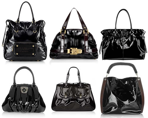
Handbags made with leather each have their own individual characteristics, as no two pieces of leather are alike. There are many different kinds of leather purses as well. Some designers prefer to use lambskin leather for its very soft, and supple feel and excellent look, whereas others may choose to work with cowhide or pigskin leather which possess tougher, more durable properties. As awful as pigskin may sound, it actually makes for a very soft and nice looking leather.
When shopping for a leather bag you don't necessarily think about what kind of leather it is, just as long as it's leather. Whatever type of leather the handbag is made with, you know you are getting quality material. For this very reason, leather purses usually cost more than any other material, but just remember that it's also going to last longer than any other handbag.
Leather purses can range in price from very reasonable to very expensive. It all depends on the handbag designer and the quality of the leather. Remember though, that when you purchase a leather bag it's going to last you a long time. So the extra expense is well worth it!
Posted in:
Fashion Tips,
Handbags
|

Mastectomy swimwear

is special swimwear needed for women who have had a breast removed. The swimwear includes a special pocket sewn in to hold the breast prosthesis in place during even the most vigorous of activities. The swimsuits come in a wide variety of designs to include either low or high necklines, wide or thin straps and skirted or saronged styles so your options certainly aren't limited. A major concern among some women is that the breast forms may be affected by exposure to chlorine from swimming or heats from sunbathing, manufacturers agree this isn't true. Another concern is that the weight of the prosthesis may be too heavy for a swimsuit. The bathing suits manufactured today are specifically made with the strongest stitching and proper fabrics to ensure not only comfort but also piece of mind.
Maternity swimwear
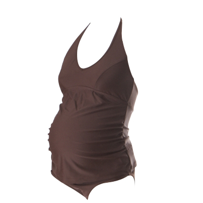
designed today has never been more practical or fashionable. Maternity swimsuits come in both two- piece and one-piece suits. The swimsuits are made with extra lining in the places that need it; most designs have built in soft-cup bras. Tankini designs come in slightly larger belly covering lengths and swimdress suits are available for more coverage. The selections of cover -ups come in both skirt and hooded designs, the skirts are often double lined with elastic waistbands. There are so many great manufacturers offering an endless array of designs and various soft stretchy fabrics that you're ensured a comfy fit during any stage of pregnancy. There are also wonderful nursing bathing suits on the market, which offer proper post pregnancy belly cover-up with built in bras for use when nursing baby.
Water aerobics

is a great all around form of aerobic exercise and an excellent form of cardio fitness. Water aerobics are safe for all ages, as the water causes your body to be buoyant, thus causing less strain and stress on your joints and muscles. Some of the special aerobic water accessories are wrist and ankle weights, active belts, aqua mats, exercise balls, aqua steps, water shoes and barbells. Many of the accessories are covered in neoprene fabric offering comfort to the wearer and chlorine resistance. The active belt is used to promote correct posture while supporting the lower back and toning abdominal muscles. The wrist and ankle weights are used for resistance to get the maximum workout, the cuffs come in various weights for different levels of fitness. It's a good idea to purchase one of the many sports swimsuits available when doing water aerobics so you're ensured a swimsuit that will stand up to your exercise routine.
Thermal wear and sun protective swimwear

are two popular ways to provide your children with either warmth or protection from the sun's harmful UV rays. Thermal wear suits are made from a specially treated, heat reflective neoprene material. The thermal swimsuits allow children to maintain their warmth safely while still allowing for the freedom of movement necessary. The sun protective swimwear manufactured today usually has an SPF of 50 (the highest rating for fabric) and most brands offer approximately a 98% sun block. The suits are made of a nylon-lycra mix, which is lightweight and fast drying. The sunsuits come in a variety of designs to include; baby, children and adult designs; sun hats and sunsuits combined with buoyancy aids. What an excellent way to protect both you're children and yourself from the sun.
Water Sports swimwear

is quite different than the standard swimsuits available for swimming and sunbathing. Water sports such as wakeboarding, wind surfing, surfing, water skiing, diving and jet skiing often require swimwear that offers both warmth and protection from extended time in cold waters. Most wetsuits are made from a specially treated heat reflective neoprene material, which helps people maintain their warmth while providing flexibility and comfort. Wetsuits are available in a wide variety of designs such as; one piece body suits with either long or short sleeves; rash and UV guards (similar to a long or short sleeved t-shirt) with hoods; gloves and boots; wetsuits with hoods. The innovative wetsuits are amazingly flexible and durable providing years of water fun.
Popular manufacturers of sportswear make excellent quality sports swimwear. These swimsuits like the standard swimsuits come in a wide variety of designs, but are specifically made to endure endless hours of activity in the pool, the suits must provide proper fit and comfort in a long lasting design often used by lifeguards and competitors. As much as the look of the swimsuit is important it is secondary to the fit and durability. Sports swimwear can include; competition swimwear, accessories, training suits, lifeguard suits and practice suits. The swimwear is also includes options such as swim caps, warm-ups, parkas and towels.
Proper fit of your swimsuit is essential whether you're petite, tall or plus sized. You want to be sure that your swimsuit is neither too small nor too large ensuring the swimsuit provides comfort, flexibility and durability.
Plus sized swimsuits

come in an excellent variety of designs to include one and two pieces suits from tankini suits to skirted suits. Regardless of your size there is a suit that will fit you properly, with swimsuits made in special bra cup sizes while offering extra lining to provide full coverage.
Designer Swimwear

is a popular line for many high fashion designers. There is no shortage on the extraordinary styles and options out there. If you are in the market for a swimsuit with that "extra something" you can find swimsuits with lovely hand sewn water drops, crystals and beads. There are swimsuits that with special technology allow you to tan through the suit, there are bust enhancing suits and tummy control suits; there really is no limit to what you can find.
With all the specialty suits mentioned we can't forget the variety of regular women and men's suits available. There are styles, colors and fabric designs to fit anyone's tastes. Swimsuits in one and two- piece varieties for women and the classic swim trunks, shorts and racers for men.
Whatever reason or purpose you have for going in the water there is swimwear that will suit your needs. Regardless of your size, your age or your activity there will be a swimsuit that provides the comfort and coverage you need. If you are planning to be out in the sun always remember to apply proper sunscreen, SPF 30 is a good idea, you also don't want to forget your sun hats, sunglasses and beach towels.
Posted in:
Clothing,
Fashion Tips
|

Guess offers very unique and stylish handbags that catch the attention of all women. The Guess barrel handbag is a popular style that offers a clean polished look. Materials such as croc print, jacquard, and vinyl with the Guess "G" logo are common amongst the Guess barrel handbags.
The Guess satchel handbag is another favorite that comes in a variety of materials and styles, and also sports the "G" logo. The Guess satchel goes with almost anything and looks very stylish. Something important to consider when buying a handbag is how much space you have inside. The Guess satchel handbag seems to be quite roomy allowing for all the personal items you like to carry with you.
These are just a few of the handbag styles offered by Guess. Check out the internet for a wide variety of handbag styles and designs by Guess and you are sure to find one that you like.
Posted in:
Fashion Tips,
Handbags
|

We sell dresses with ruffles, capris with lace, tee shirts with beading, and a host of other adorable ensembles. If your little girl loves anything pink, then she will delight in the Lipstik line, as many of these pieces come in vibrant shades of pink. Dresses come tiered, with layers upon layers of soft ruffles. Does your little girl feel more comfortable in pants than in skirts and dresses? Well, we sell a host of funky pant-sets that come in adorable styles that cater to a girl's sense of fun and fantasy.
At www.HugsnKissesboutique.com, we believe that consumers should have access to the best children's clothing labels, without having to travel far and wide. Our online site is a work in progress, and we strive to constantly update our selections according to the latest fashions. Lipstik is one of our most popular labels, and for good reason. The clothing is well made and durable, and the designs are whimsical and fresh. You don't have to worry about beads falling off or ribbons coming loose, as great attention is paid to detail and craftsmanship
Posted in:
Fashion Tips
|
2. For business situations match your handbag, shoes and belt. Black shoes should be matched with a black handbag. This is not a time to get creative with your accessories or to wear colored shoes.
3. Do not neglect your outerwear. Purchase a good quality coat that can be worn with either pants or a skirt. For cooler weather don't neglect your outdoor footwear. For skirts choose long knee-high boots.
4. Keep shoes and boots in a good state of repair. Scuffed shoes with worn heels will ruin the look of your outfit.
5. To complete your look choose soft leather gloves that will add a nice touch as well as keep your hands from getting chapped.
6. Choose clothing material that reflects the season. Heavy fabrics and tweeds are best for Fall and Winter and will look out of place during Summer, as light linen fabrics will look out of place during Winter.
7. Always wear a belt where there are belt loops. Choose a good quality leather belt and don't be tempted to wear a flashy or plastic belt. If you don't like belts choose pants without loops.
Posted in:
Clothing,
Fashion Tips
|

Comfort and convenience are of utmost importance and are tastefully combined in these messenger's bags. Men and women from all walks of life can look smart and sophisticated as they go about their daily business with their messenger carrying bag. Manufacturers are starting to create bag styles that appeal to an even broader range of lifestyles. This means there are messenger bags out there to suit everyone's tastes.
The fact that these messenger's bags are made with waterproof vinyl fabric sewn together with heavy duty stitching and protective padding gives you comfort in knowing your precious cargo will be protected from bumps and drops. There is plenty of space in a messenger carrying bag for all of your necessities such as laptops, business files, and other items. With all of the functionality of a briefcase, a messenger bag is more convenient for commuters who travel by foot or bicycle.
If you are looking to purchase a messengers bag, check out the internet for a great selection of brands and prices. Make your commute to work much easier by getting yourself one of these messengers bags, you'll be glad you did!

Q) What is the recovery time for permanent makeup?
A2) Everyone is different, but a general rule would be 3-7 days on the surface, and another 10-14 days below the surface. It is common for a person to return to work the same day. Lips will have some residual swelling and will chap. There may be slight swelling after the eyeliner; brows may look darker than usual - all of which softens in a few days.
Q) Can I still wear traditional makeup over the tattooed area?
A) Yes, after the area has healed. Permanent makeup is designed to be only an enhancement to your natural features. Wearing additional cosmetics is a personal choice that enhances your permanent makeup.
Q) What if I decide to have cosmetic surgery?
A6) Plastic surgery has no affect on properly placed permanent makeup. However, if you're contemplating plastic surgery, you may opt for the surgery before the permanent makeup.\
Q) What reaction is common regarding permanent makeup?
A) Women are usually amazed at how awesome, natural and subtle permanent makeup is. They wish they had done it a decade ago. No more smudged makeup, daily hassle, etc. Life has become simpler!
Q) Who would benefit?
A) Active women and men ... those needing feature correction; people with allergies to make-up ... athletes ... the vision impaired ... alopecia sufferers ... those looking for a natural look - or those looking for something more dramatic.
Q) How is it done?
A) A sterilized, disposable needle is used to implant hundreds of tiny dots of colored pigment beneath the basal (top) layer of the skin enhancing natural features.
Q) Does it hurt?
A) The topical numbing anesthetic creams used today are much stronger than in years past. If you follow the simple rules beforehand of: no alcohol, aspirin, blood-thinning medications, Vitamin E, garlic or herbal supplements 3, preferably 5 days prior to your appt. will greatly reduce any discomfort associated with the procedure. Also, have no caffeine the day of the procedure. Following these guidelines greatly increases your comfort level during your permanent makeup procedure.
Q) How long will it take?
A) Most of the procedures require approximately 2-3 hours. The most important part of all the procedures is the artwork and choosing colors, both of which require approval by the client.
Q) How soon will the results be visible?
A) Within seven days you will notice a visible difference. We require all of our clients to come in for verification 30 days after creation at which time any adjustments will be made (if necessary).
Q) How long will it last?
A) Normally one to five years maybe longer. Re-enhancements otherwise known as "touchups' or "refresher color boosts" are recommended for maintenance. You must remember that permanent makeup is a "low", not a "no" maintenance procedure. You eventually will need a color touchup when your color fades. Once the color lightens you will know that you are ready for your refresher color boost! You cannot avoid this fact - everything fades with time, especially anything out in the sun.
Q) What about allergies?
A) Those with allergies are particularly good candidates to permanent makeup. If you are prone to allergies, you may ask the technician about an allergy test. The allergy test will be done using a red pigment. The red pigment is usually the one that will cause the most noticeable allergic reaction if there will be a reaction at all. Reactions are rare.
Q) What does it cost?
A) Fees vary according to the creation required and will be determined at a free consultation. But remember, you get what you pay for. You can expect to pay anywhere from $300-$600 per procedure, depending on your technician and your location. The smart thing to do is to for sure not to choose the cheapest artist, but you need not choose the most expensive artist either.
Q) What if the shape isn't what I want?
A) The eyebrows are drawn on with semi-permanent marker prior to the start of any procedure, so you will see exactly what is going to be done before anything permanent is applied.
Q) What about removal of pigment?
A) We call removal "pigment lifting" which is available and works very well if the technician is trained in the process. Typically only small areas should be attempted to be lifted with either a salt/saline mixture or a similar "lifting" product, used for this purpose only- trying to removal larger areas of permanent makeup pigments will require more extensive treatment, such as a laser. Under these circumstances, contact a dermatologist.